What I learnt trying to optimise a single page for screen readers using Framer
Jun 5, 2024
I’ve been interested in understanding more about how people who are visually impaired use browsers and websites. When I design an interface, I always make sure that I check the guideline for text size and colour contrast, and run my screens through a simulator to see how colour-blindness may impact the user experience.
I regret to say that, in my practice, I have never took the time to use a screen reader to understand how visually impaired people experience it. I have recently moved away from SquareSpace to Framer, which gives a much more control over the layout and integrates with Figma. I’m taking this opportunity to make my portfolio accessible to screen readers, and I am documenting my findings here.
Using VoiceOver
I’m a Mac user, and iOs comes with its own screen reader, VoiceOver. VoiceOver is the third most used screen reader, behind NVDA and Jaws, which are both for Windows.
I know how screen readers work in theory, but trying to use one for the first time is a very jarring experience. A robotic voice starts speaking, describing the element on my browser that’s highlighted with a thick grey border. A text box appears at the bottom of my screen, repeating in writing what the voice says. Before I have fully processed it, the voice has moved on to the next element, and the next, and the next. I am immediately overwhelmed.
I’m quite bad at splitting my attention. For reference, I have once missed a boat because I was on the phone and could not check the timetable while talking to my mother. In this, I’ll admit I may be an edge case. My first reaction is to click the exit button in the description box, which stops VoiceOver altogether.
I start over.
I do this an embarrassing number of times before I admit I cannot just wing it. I have to take the tutorial.
The Voice
The default voice is called Daniel. It’s masculine voice, English, with a warm timbre and a robotic tone. First thing I notice is that Daniel doesn’t know how to pronounce my name as it reads my website’s domain out loud. However, as I move out of the webpage and into the google chrome tabs, the voice changes. It sounds like an Italian woman’s voice, and she gets my name right. Different tabs are read by different voices: the one with the French podcast I’m listening to has a male French voice.
In the VoiceOver settings, I can choose from dozen of different voice in various languages. I can also customise the speed and the verbosity.
Verbosity allows me to decide what level of detail I want the voice over to get into when describing an item.
For example, when set at high VoiceOver will describe the home as “visited link, heading 1, Home”, while when set at low it will simply say “home”.
I find thats setting it at low improves my experience quite a lot, but that’s also because I have visual support as I use the screen reader.
The verbosity can be defined at a very specific level, as you can see int he screenshot below.
Behavioural differences
I realise that all I want is to be able to move up and down the page as I please, and I can’t really do that.
When I use a website for the first time, I usually skim the entire page, then go back up and look more carefully for what I need. I do this to see how long the page is and how much content I should expect. I also want to see how it looks and if there’s any interesting visual element I can take inspiration from.
The screen reader, however, simply follows the structure of the page. If multiple elements are within a group, it will read the name of the group and wait for the user to interact with the group to read out the items in it.
The page hierarchy, as presented in the HTML code, is the only one that matters. Visual hierarchy will, obviously, go out of the widow.
We know that users often look at a webpage in a F pattern, tend to skim headings, and are attracted (or distracted) by animations. The level of attention each elements on the page gets depends on their colour, position, and proximity to other elements.
With screen readers, I find myself having to dedicate the same amount of attention to each item that’s being described. I imagine that, with experience, screen reader users are also able to know which parts deserve more attention, but as a newbie I have to force myself to maintain focus.
Armed with a bare minimum knowledge of how to use VoiceOver, I start navigating my own website.
Website name and Logo
I structured the homepage of my portfolio to have headings with a simple I statement: I am, I do, I made. In my mind, this was the epitome of simplicity, and it works when you look at the entire page and see the pattern.
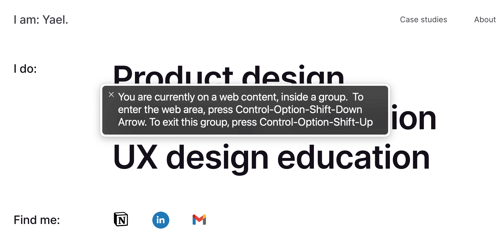
The website logo, classically top left, says: “I am: Yael”. It is the first thing VoiceOver reads, and it does not give enough context about the website.
Framer has an accessibility feature that allows to add a special accessibility label - called Aria label, and set it to “Yael Olivo - Product designer - Portfolio - home”. I added “home” because on other pages, this is effectively the home link.
A screenshot of my portfolio home page showing how Voice Over reads the first element of the page.
Navigation
All my case studies are on the homepage, not on a separate landing page, so I thought it would make more sense to add dropdown to access each case study from the homepage. The way Framer allows the creation of dropdowns is through an animation panel, which plugs in some preset javascript to handle the interaction. I tried to open the dropdown using VoiceOver and keyboard commands, but it just doesn’t work. When I open the link, it scrolls down the page and reads “office replacement character” five times.
Perhaps I’m still not proficient enough at using VoiceOver, but I don’t think a dropdown is absolutely necessary, so I will change it to a link to a landing page.
The label I chose for this menu item is “work”, and I’m pretty sure that anybody who visits a website that’s clearly a portfolio knows what to find there. However, I think labelling it “Case studies” makes it cleared. I also added and Aria label that says “Read my case studies.”
A screenshot of my portfolio navigation before optimisation, featuring a dropdown menu that cannot be opened with a screenreader
A screenshot of my portfolio navigation after optimisation, with a simple link to a landing page
Hero
The hero consists of some large text listing the three main things I do in my practice: I’m a product designer, a UX design instructor, and I have a lot of experience creating and facilitating workshops. This works really well with a screen reader.
Below, there are three icons that link to my notion, my linkedin, and my email. These were not labelled, so VoiceOver reads the full link, which sometimes is a long string of numbers, sometimes it’s just “link”.
Easily fixed: I’m assigning a descriptive Aria label to each one.
The same elements are repeated on the footer, so I correct that at the same time.
Case Studies Thumbnails
Case study thumbnails worked fairly well, with two small exceptions. The client name is placed above the name of the product, so it gets read first. Since I worked on a few products fort the same client, I prefer the product name to come first. Secondly, each project has some tags. They look like tags and they are visually separated the rest of the text. VoiceOver, however, just read them after the project description and they just sounds like extra words at the end of a paragraph.
I wrote an Aria label for each case study, and VoiceOver just reads that instead of the content. Pretty handy.
Testimonials
The testimonials block is pretty straightforward: a title that reads “People say:”, an extract from a testimonial, and a link to read more. However, the title and the link are on the same line, and the testimonial below. This means the screen reader will read the title first, then the link, and finally the testimonial. Narratively, it makes more sense for the link to come last, so I moved it to the bottom of the block. It is also more consistent with the rest of the page, so it’s a win-win.
Conclusions
Optimising for screen reader is definitely time consuming, but I can see how a few simple consideration during the design phase can save a lot of time. I feel like I barely scratched the surface of truly understanding what it means to consistently test and optimise for it, but the process has given me a lot of insight.
Here’s some learnings from the experience:
Testing for screen reader and document it with screenshots is a pain: the voice over panel with the written description only lasts a second or two, so the screenshot must be taken very quickly. Moreover, going back and forth between the live site and the editor means constantly turning the screen reader on and off.
Screen readers can be used to spot typos in the text, empty frames, and broken images
Interactive elements like dropdown menus and toggles can create problems with screen readers, and must be coded in a specific way
All in all, I would say that Framer does a good job enabling to optimise for screen reader, with the caveat of interactive elements.